
Below are some inconsistencies between Titanics site and the old osu site, as well as some new features i thought could be added to the site.
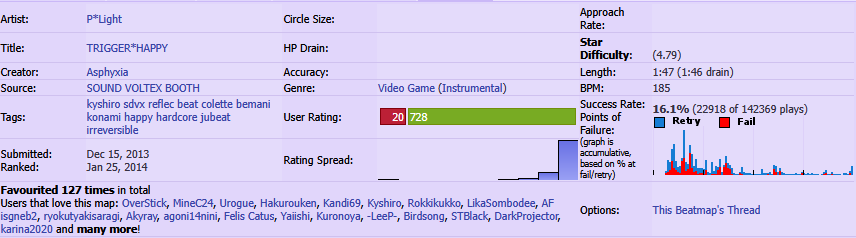
Map Details Titles
Currently some titles are bolded and others aren't:
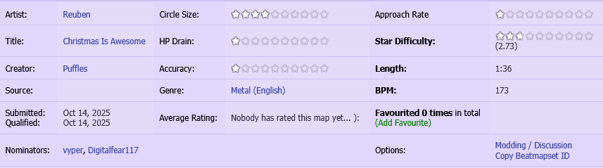
I feel they should all be bolded, or at least keep it consistent with the old osu site:
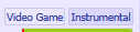
Map Tag Boxes
Currently a map cards tag boxes underline when hovering:

The old osu website highlights the box itself:
Map Card Side Bar
It'd be nice to bring back the sidebar from the old osu site that showed favorite, forum, and download options:
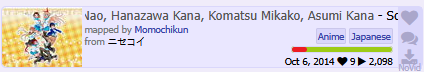
Map Card Title
Currently the title for maps is highlighted in grey when hovering:

The old osu site highlights it blue:
Map Card Favorites/Plays
The favorites/plays is currently missing thousands separators compared to the old osu site:
Titanic

Old osu

Scoreboard
Currently the scoreboard highlights in different color compared to the old osu site:
Titanic
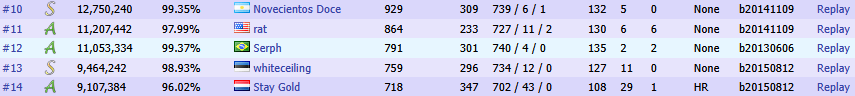
Old osu

This is also completely missing in other places like rankings leaderboards.
Recent Activity
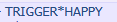
Titanic

Old osu

"rank #x" should be bolded if the score is <= top50 like the old osu site. Username should also be bolded.
It'd also be nice to have an image of the rank achieved like the old osu site.
User Titles
Users titles should be bolded like the old osu site:
Titanic
Old osu
Friend Button
The friend button icon is incorrect and the text is worded differently compared to the old osu site:
Titanic

Old osu

Navigation Panel
The top right of the navigation panel is missing rounding:

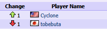
Change
It'd be nice to have the change column on leaderboards from the old osu site:
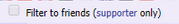
Filter
It'd be nice to filter friends only on leaderboards similar to the old osu site:
Beatmaps
Map Details Titles
Currently some titles are bolded and others aren't:
I feel they should all be bolded, or at least keep it consistent with the old osu site:
Map Tag Boxes
Currently a map cards tag boxes underline when hovering:
The old osu website highlights the box itself:
Map Card Side Bar
It'd be nice to bring back the sidebar from the old osu site that showed favorite, forum, and download options:
Map Card Title
Currently the title for maps is highlighted in grey when hovering:
The old osu site highlights it blue:
Map Card Favorites/Plays
The favorites/plays is currently missing thousands separators compared to the old osu site:
Titanic
Old osu
Scoreboard
Currently the scoreboard highlights in different color compared to the old osu site:
Titanic
Old osu
This is also completely missing in other places like rankings leaderboards.
Profile
Recent Activity
Titanic
Old osu
"rank #x" should be bolded if the score is <= top50 like the old osu site. Username should also be bolded.
It'd also be nice to have an image of the rank achieved like the old osu site.
User Titles
Users titles should be bolded like the old osu site:
Titanic
Old osu
Friend Button
The friend button icon is incorrect and the text is worded differently compared to the old osu site:
Titanic
Old osu
Other
Navigation Panel
The top right of the navigation panel is missing rounding:
Change
It'd be nice to have the change column on leaderboards from the old osu site:
Filter
It'd be nice to filter friends only on leaderboards similar to the old osu site:


